The real inflation for the last decade has been around 6% on average, calculate for yourself that you will have lost money in all the 3 classic investment classes - the most in stocks as they need to double from here just to make back your inflation losses. The zero interest rate of the FED only benefits the banks profit as they have far cheaper financing and in cases of Goldman they make an extra 15-20 bil. profit at least as they have no Mainstreet exposure completely windfall profit.

The SGS Alternate Unemployment Rate reflects current unemployment reporting methodology adjusted for SGS-estimated long-term discouraged workers, who were defined out of official existence in 1994. That estimate is added to the BLS estimate of U-6 unemployment, which includes short-term discouraged workers.
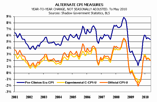
America is not what the mass media try to make you believe already for a long time - Clinton is one of the biggest liars in the US history since he started with Greenspan the phony stats game again in full gear - the blue line is the one which is real as alone last month over 600k were kicked out of the statistics instead of over 700k unemployed only 85k were reported.
Take the time to read these excellent research on the mortgage situation and you will see easily how screwed up the real situation is and t hat the pending losses of banks are closer to the 5 tril mark not mentioning all the derivatives which should double that sum easily.
http://www.moremortgagemeltdown.com/download/pdf/T2_Partners_presentation_on_the_mortgage_crisis.pdf

No comments:
Post a Comment